Entergy Renew
Improving conversion rates with user research
Project Overview
Team: PM, Front End Dev, Back End Dev, Strategic Designer, Growth Strategist, UX Designer
Role: UX Designer
Project: Mobile first website for Entergy, a private utility provider
Duration: 3 months
Tools: Figma, Jira, UserZoomGo, Webflow

Impact
We launched the site for two opcos in the spring of 2022. Our primary goal in the design and build of Renew was to deliver a website where users whether residential or business could sign up for Entergy’s green products without too much hassle, and if they wanted to learn more before signing up they would have plenty of accessible resources to do that.
Our success here is best measured by the uptick in folks signing up on the site. It’s hard not to credit that success to the user first work we did during our research, design, and development sprints.
5 minutes
How many minutes it took the Louisiana solar offering available through Renew to totally sell out.
3 months
The number of months it took for total signups to community solar projects to exceed the combined number of signups from the past 2 years.
User Testing
Solarity, Entergy’s previous offering in this space, presented a challenge for Renew. I would be leveraging what I learned from one product to build another. This meant that I would need learn as much as I could from Solarity. Along with using think aloud protocols, I also had users force rank Solarity against our prototype.
Renew Prototype vs Solarity Website
Takeaways:
I knew the Solarity site would score higher around visual presentation and possibly UX, but it was important that the information clarity be high for us. Since I’d put emphasis on cultivating that clarity in the design work, I was pleased to see it come through in the testing.
How Did I Use What I Learned?
Something I wanted to avoid were long sections of legal speak that obfuscated more than clarified. In other words, I wanted the educational aspect of the site to be an accessible one that could lead to decision making versus something that might feel overwhelming and drive folks from the website. Below is our dynamic form that provided “Things to Remember” relative to a user’s location.
Transparency. Explaining in an upfront way the customer’s charge as well as the credit they will receive on their bill. The small print was bulleted out for them so they can see it before signing up. The information they saw was catered by location and product.

Outcomes
Renew solved the user problem and the business problem. Renew minimizes confusion and increases transparency around the solar community offering. We leveraged extensive user interviews and focused feedback sessions to uncover areas where we could improve that aspect of the user experience. Users were able to quickly and efficiently navigate to our dynamic form with a clear understanding of what they were buying.
Visit the live site here: renew.entergy.com.
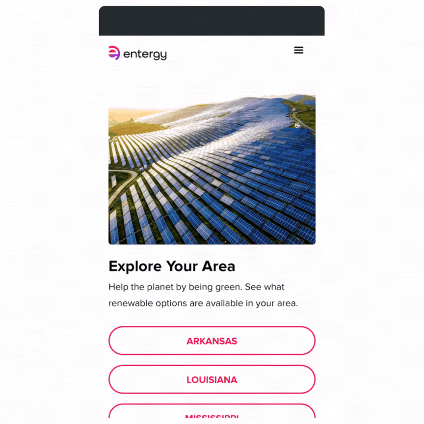
Our solution is a simple sign up flow that starts on a static web page and ends through a dynamic form submission. The form updates based on the user’s location.
User selects their state. Community solar is limited to location.
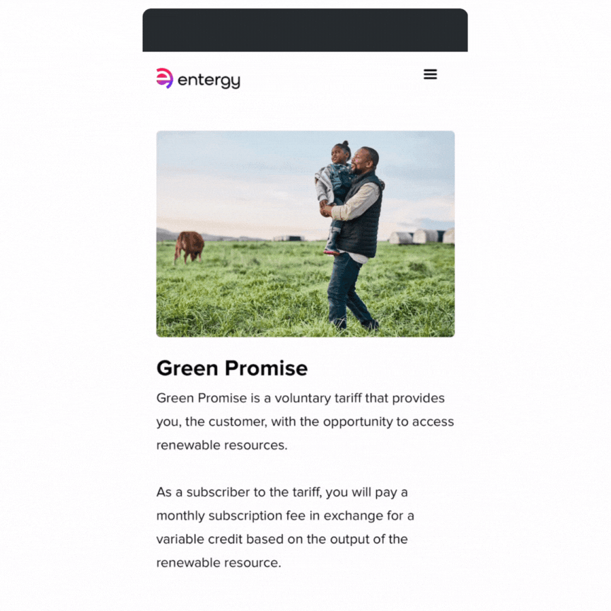
User researches and selects their product. This product is called “Green Promise.”

User submits a dynamic form that updates the “Things to Remember” section based on their location.
Learning Outcomes
We built much of Renew with Webflow, a low code solution. When we used my Webflow built designs as a starting point for understanding product or UX issues that would require engineering to build something, it was easier to frame and execute against problems than working from a Figma file.